Is there a way to visualize the execution graph?

When using the graph executor, the graph is serialized as JSON. Is there any way to visualize this graph?

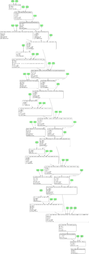
For now, I put together a simple script to generate graphviz (dot) representations (example below), but if there’s a better/supported solution I’d love to learn about it.

We don’t have an official solution yet. This has been a long-standing problem, and there have been several attempts. The most recent one is https://github.com/apache/tvm/pull/10085

1 Like

Thanks @masahi. If I’m not mistaken, the PR you mention seems to be about visualizing Relay IR, not the execution graph. While visualizing Relay IR would be fantastic (and likely more widely useful), I was asking about the latter.

The execution graph seems relatively simple, and I was able to put together a script based my initial understanding of the data structures. If there’s nothing else and other people may find it useful I’d be happy to contribute it: is there a good location for debugging scripts?

I would say we don’t really have a notion of “execution graph”. We do have a graph runtime that conceptually operates on a graph, but that is a purely implementation detail most users do not need to care about. We also have the VM runtime that doesn’t involve a runtime graph at all, it is very similar to a byte-code interpreter in VM-based languages.

The closest thing to the “execution graph” is probably a Relay IR after optimization such as op fusion. But I suppose we’d use the same visualization tool for Relay graphs before or after opt.

1 Like

Yes, this seems very useful. I’ll ask around folks and let you know how to proceed. Thanks!

1 Like